The venue and the pieces you already own decide which of these palettes is yours: a brick wall or a beige ballroom carpet will fight some colors and flatter others, so test any palette against the room before you commit.
The palettes here run from Timeless White, where texture does the work, to Deep Red and Emerald, and most need only one large surface in the main color.
1. Dusty Pink
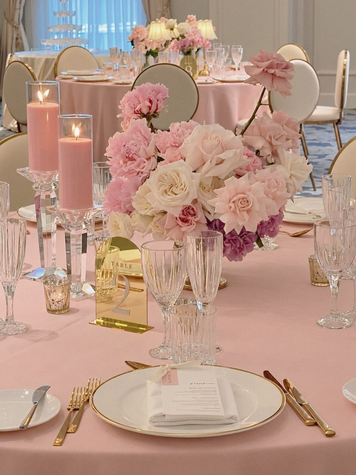
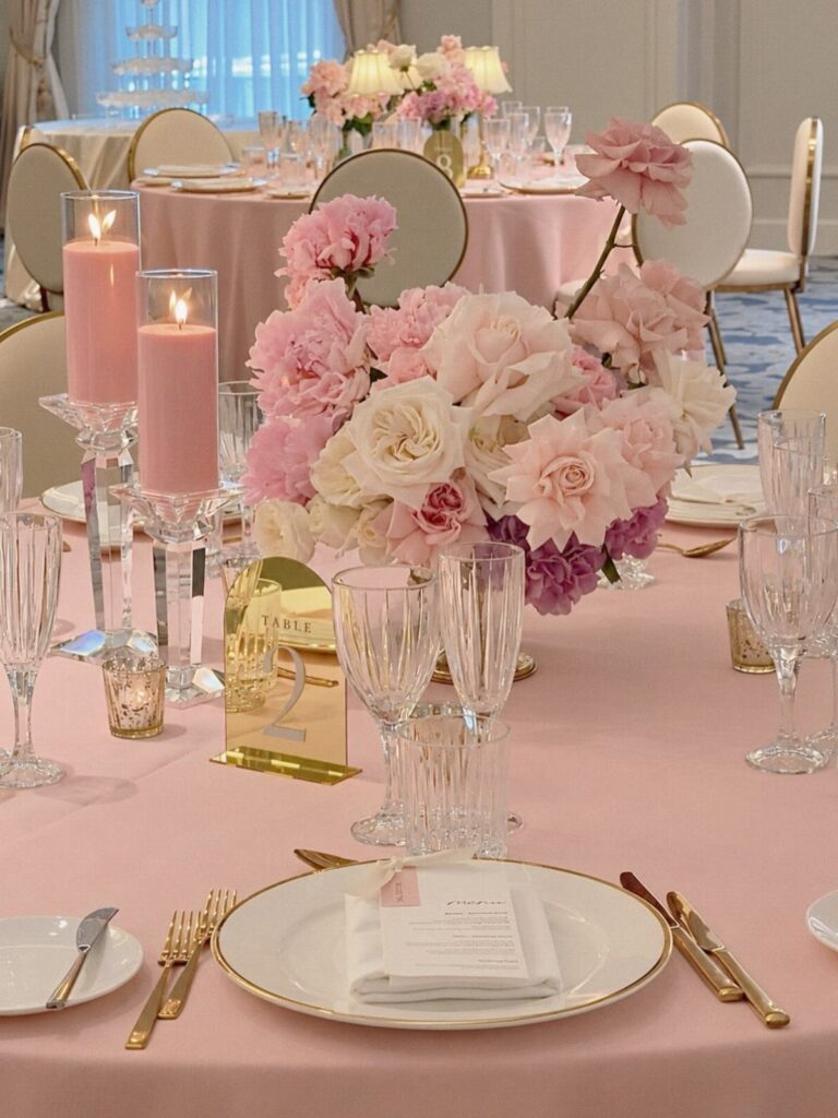
Dusty pink stays out of sugary territory once something metallic sits next to it, like brushed gold flatware or a copper charger.
Gold cutlery and a gold table sign do that job on a pink tablecloth, and I would copy the move.
Keep the flowers and candles in the same pink family so the table reads as one soft tone. A single metal finish is enough.
2. Navy and Blush
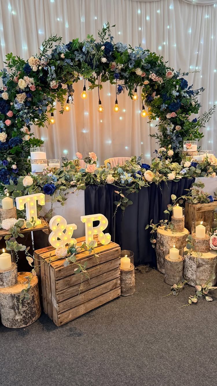
Navy gives a head table weight, and blush keeps that weight from feeling stern. I like to put the navy on the large surfaces, like the tablecloth, and let blush live in the flowers.
Wood details such as crates and birch candle holders warm the pairing up. Light-up initials add a third element without adding a third color.
3. Sage Green
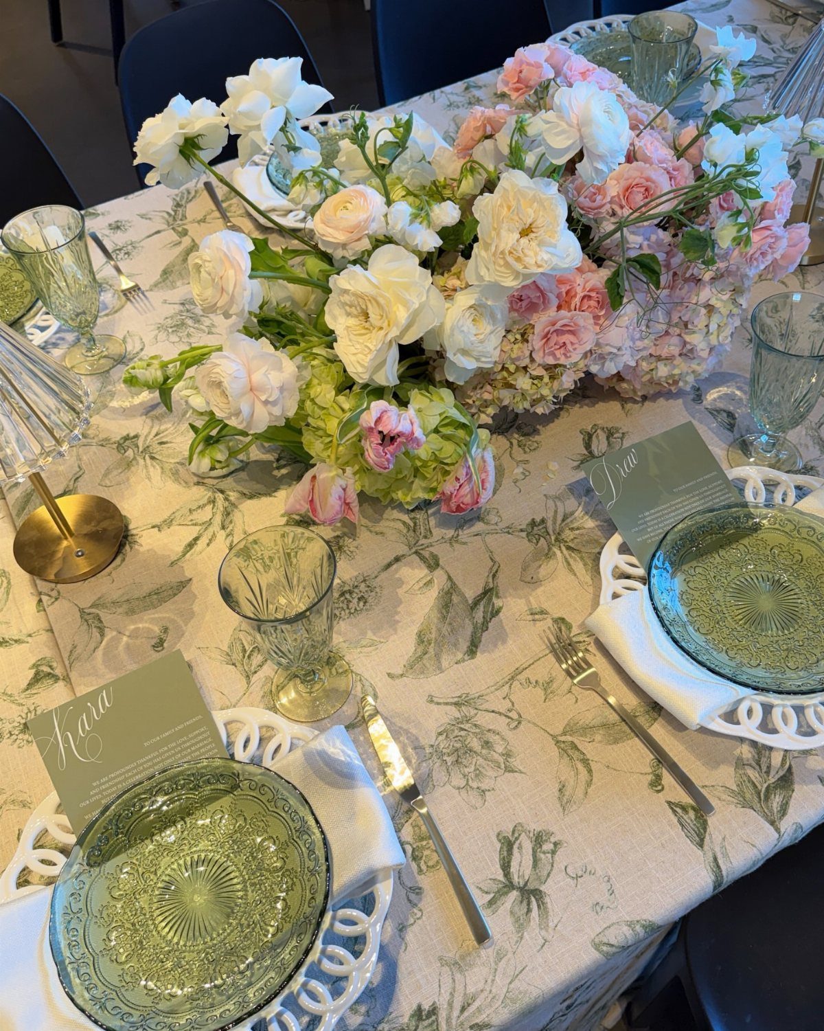
Sage green is easiest to use in glassware and linens, since those cover the most table. Pink and white flowers on top stop the green from going flat.
Printed botanical linens can carry the whole palette on their own, so the rest of the table can stay simple. Personalized place cards finish it cheaply.
4. Burgundy and Navy
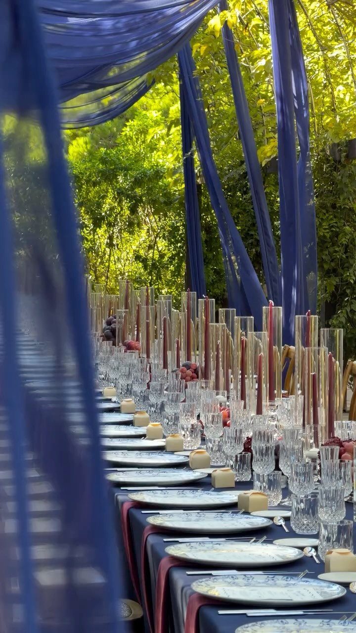
Navy linens with burgundy candles make an evening table feel romantic, and white plates keep 2 dark colors from swallowing the room. Burgundy taper candles and glass cylinders add height to a table without a big floral spend.
Skip heavy dark flowers here. Greenery from the setting already fills that role.
5. Toffee Tones
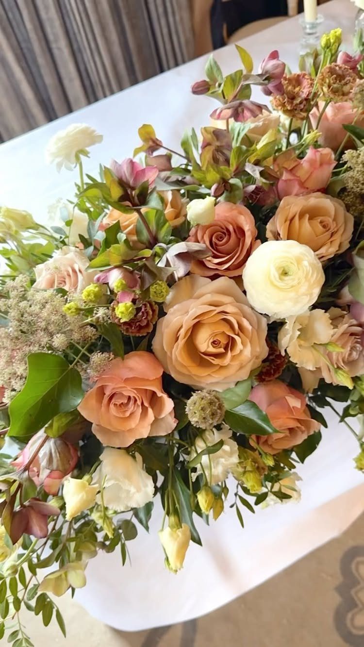
Toffee, peach and cream roses mixed with ranunculus make a warmer, softer palette than most couples expect. The creator of this arrangement named ranunculus, roses and hellebores among their favorite flowers.
Pair the blooms with a plain white tablecloth so the color stays in the centerpiece. Ask your florist to build the arrangement around one toffee shade, then add peach and white around it.
6. Peach and Sage
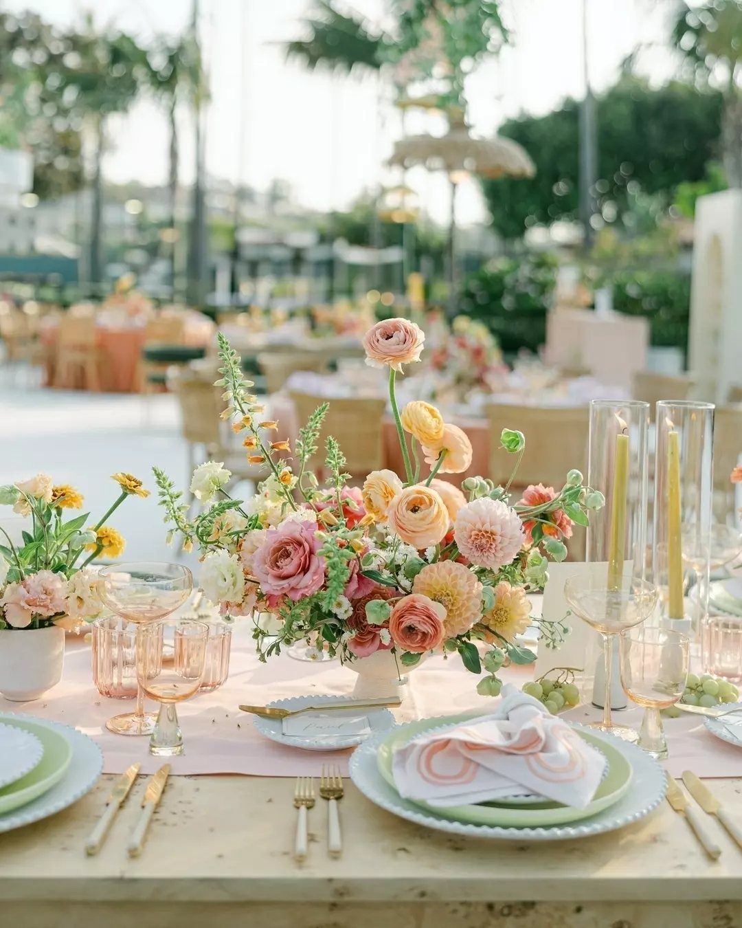
Peach glassware and sage green plates put this palette on the table itself, so the flowers don’t have to do all the work. Peach and pink blooms in between tie the 2 colors together.
I’d pick tableware first and match the flowers to it afterward.
7. Timeless White
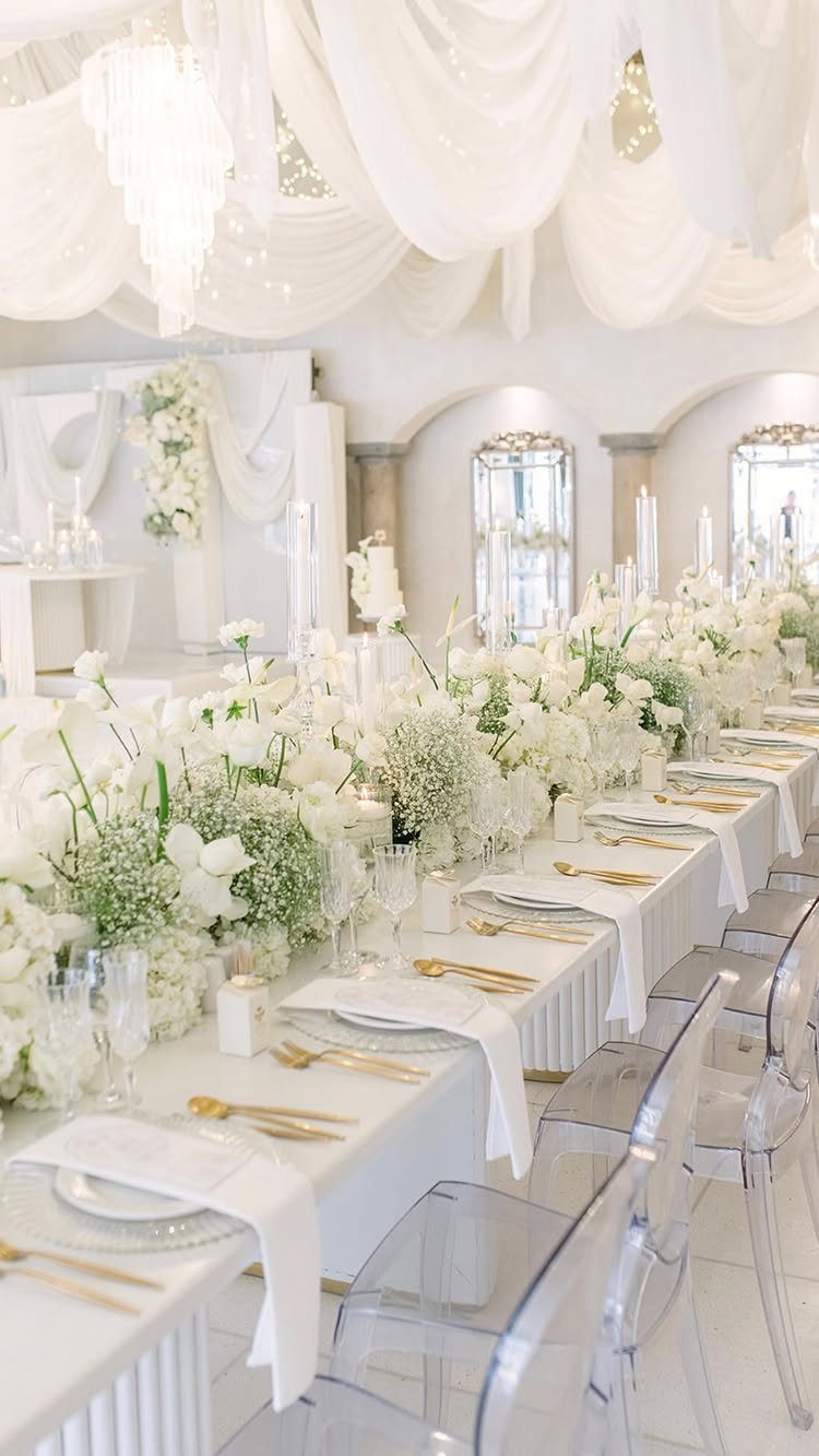
White works when texture does the talking. Keep the drapery, crystal and chair rentals pale too, and the white flowers can run long down the table without competing with anything.
Gold cutlery works as the one warm note, and a single metal is plenty. Ask your florist for a few shades of white and cream so the arrangement has depth.
8. Bright Autumn
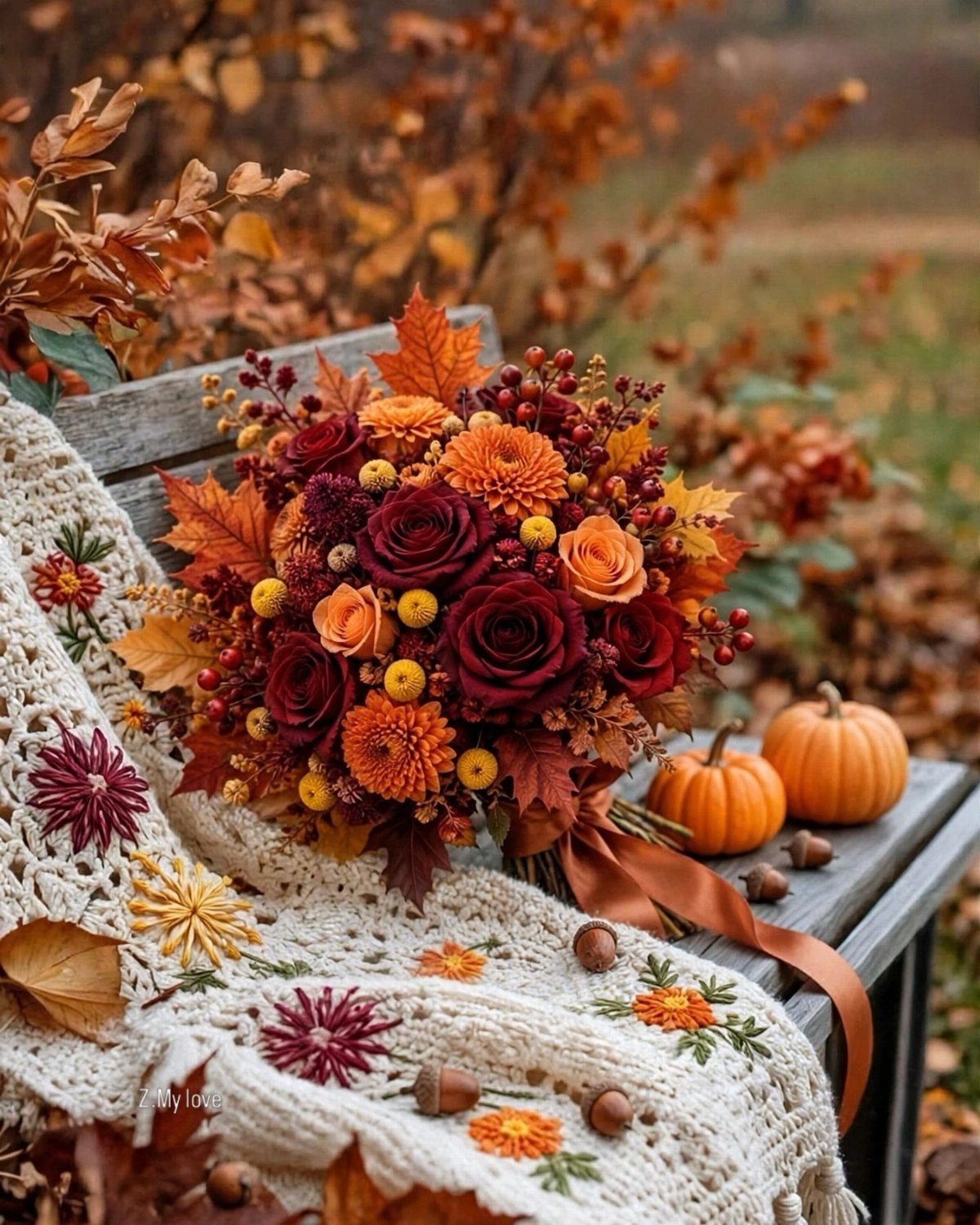
Red, orange and yellow blooms wrapped with real autumn leaves give a bouquet that echoes the season outside. Small pumpkins and a crochet blanket carry the same palette into photos for almost no cost.
Let the bouquet be the loudest piece, with everything else staying muted. Bright autumn is strongest when one thing leads.
9. Pink and Gold
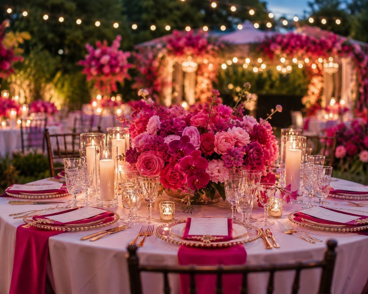
Bright pink roses against gold plates give a table real glamour, and pink napkins repeat the color without adding more flowers. White candles and string lights keep an evening setting from feeling heavy.
Choose one pink and stick with it across napkins and centerpiece. Gold on the plates and cutlery is plenty, so skip gold in the flowers.
10. Pink and Black with Gold
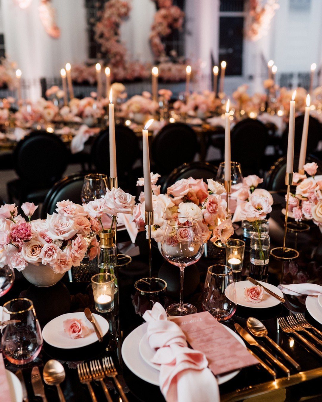
Black surfaces make pink roses look softer, and gold cutlery bridges the two so the table feels deliberate. White plates and tall white candles give the eye somewhere to rest.
I like this best for an evening reception, where black reads as sleek instead of severe. Keep the roses in one pink so the contrast stays crisp.
11. Modern Black and White
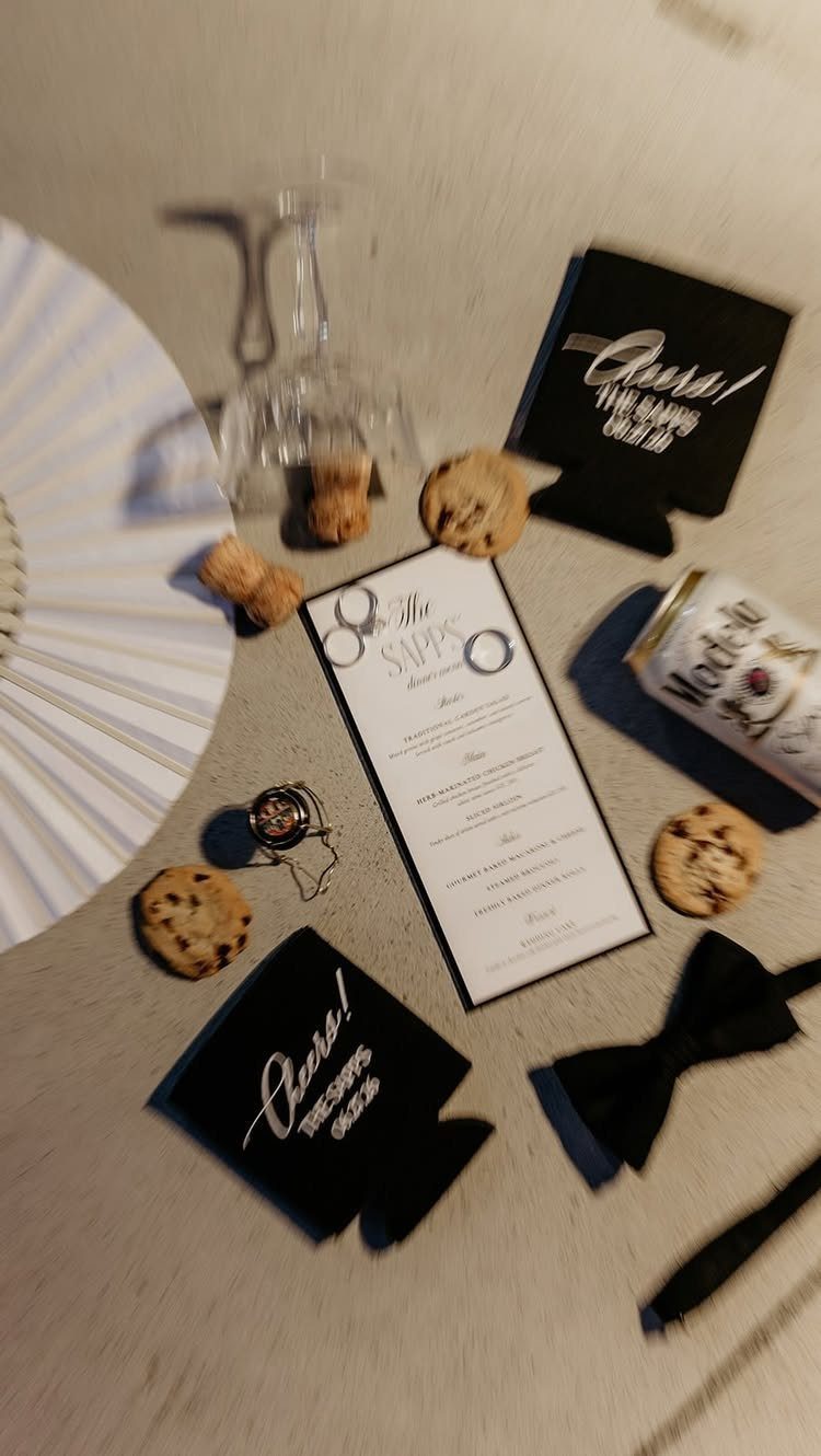
Black and white is easiest to carry through paper goods and small extras: a menu, a bow tie, custom koozies. A name or a short phrase printed on each makes the set feel personal.
Keep everything in the same 2 colors, and let a neutral surface do the rest. Cookies, corks and a champagne glass add texture without adding a third shade.
12. Deep Red and Emerald
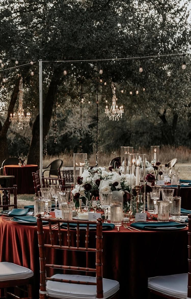
Red velvet on a long outdoor table is the boldest move in this palette, and dark green napkins keep it from turning flat.
I would let the cloth be the only large red and keep the flowers lighter. Gold chairs and string lights add warmth after sunset.
13. Burgundy and Cream
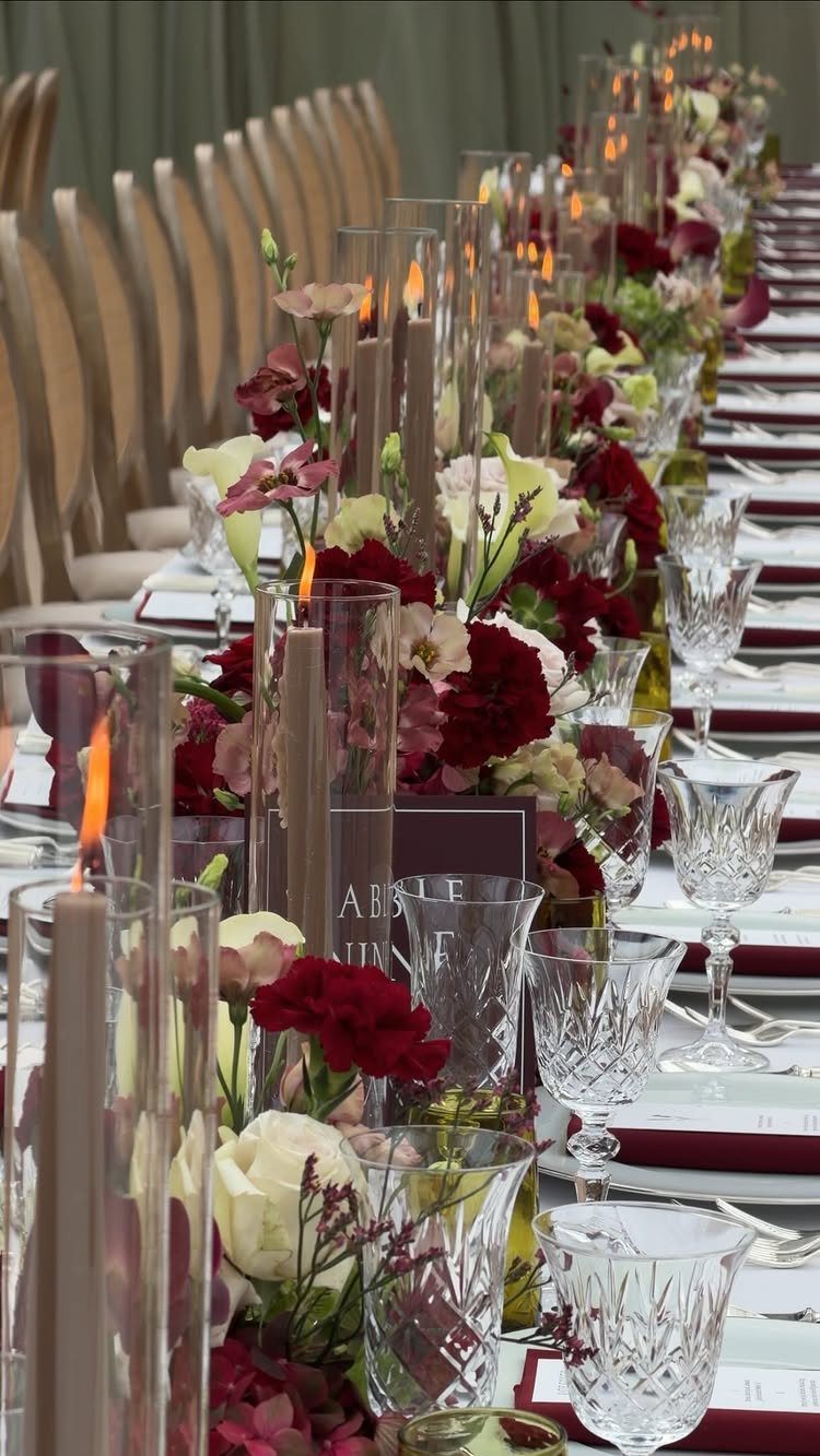
A white tablecloth is what lets burgundy and cream read as formal instead of heavy. The pale cloth gives dark flowers a clean ground, and cream blooms soften the burgundy so the arrangement keeps its depth.
Taper candles in tall glass cylinders add height down the center of the table, and burgundy glows best in candlelight, so pair them with clear crystal glassware to scatter that light across the white linens.
Ask your florist to keep the burgundy in one or two shades so the table stays elegant.
14. Olive Green and Pastels
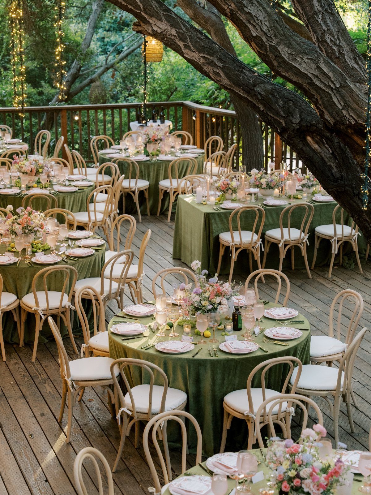
Olive green is the unusual choice here, and it works because pastel flowers look softer against it than against white. Put the olive on the linens, the largest surface, and keep the arrangements light and small in color range.
Light wood chairs suit an outdoor deck and keep the palette earthy. I would limit the pastels to two or three shades so the green stays the anchor.
15. Sage and Yellow
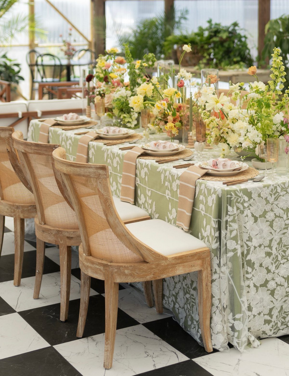
Sage linens with a floral print already carry a pattern, so yellow and white centerpieces can stay simple and still pop. Yellow is the accent, which means a few bright stems go a long way.
Wooden cane-back chairs add a warm, natural texture without adding another color. I would skip a second print anywhere else on the table, since the linens are doing that job.
Choosing Wedding Colors
Start with colors you actually like, then test them against 2 things: the venue and the photos you keep saving. A palette that looks great on a screen can fight a red brick wall or a beige ballroom carpet.
A palette can run through the outfits, bouquets, stationery and decorations without any of them being an exact match. Close is fine.
If you can’t settle on a color, go neutral.
Beige, tan, ivory or black all work for bridesmaid dresses, and white linens, black suits and cream roses never look dated. Add greenery and white flowers, and the whole look stays calm and cheap to pull off.
Mixing Colors
Bridesmaids can wear different cuts, and different colors too, and the group still looks planned. Mixing them gives wedding party photos more depth than one solid block of a single color.
There are 2 ways to do it. The one-color route is safer if you worry about clashing.
Purple is a good example. Lavender paired with a paler or deeper purple looks easy, and those tones move into dresses, bouquets and tables with very little fuss.
Seasonal Inspiration
Look at your wedding date and ask what you like best about that season. Each season hands you a ready palette through its blooms, foliage, weather and holidays.
Treat the season as a starting point, not a rule. Your favorite color can lead the whole scheme or show up as one accent, depending on how loud you want it.
Colored uplighting changes how walls, linens and skin tones read, so ask the venue or vendor what the room and your photos will look like with it on.
Frequently Asked Questions
How many colors for a wedding color scheme?
There is no strict limit, so pick the number that fits your vision. Two or three shades keep a table easy to pull together: a pink with one metal, navy with blush, or olive green with two or three pastels.
Colors can travel across the outfits, bouquets, paper goods and tables without any 2 pieces being identical; a near match reads as intentional.
What are some good color palettes for a fall wedding?
Bright autumn blooms in red, orange and yellow, wrapped with real autumn leaves, echo the season outside.
For a more formal fall look, burgundy and cream work well: white linens, cream flowers and burgundy tapers in tall glass cylinders feel polished, not heavy.
Terracotta with ivory and sage green is another warm option, pairing burgundy or terracotta with softer neutrals. Dark shades like olive green, black and burnt orange also work on bridesmaids.
What are some popular wedding themes?
Rustic, vintage and garden-inspired weddings are the popular picks.
A rustic look can come from wood details like crates and birch candle holders on a navy and blush table. A garden feel comes through sage green linens with pink and white flowers on top.