These palettes run from a single burnt orange accent on a plain table to a full black and white scheme, with navy, Vibgyor, dusty blue and gold, and pink and green in between.
The one fact that decides which fits is your venue’s light and setting: a wooded site supplies natural colors with earth brown for free, while a dark scheme like black and deep red needs more candles than you’d expect.
Pick the palette your space already half-delivers, and spend the budget on small, replaceable pieces such as sashes and menu cards.
1. Burnt Orange
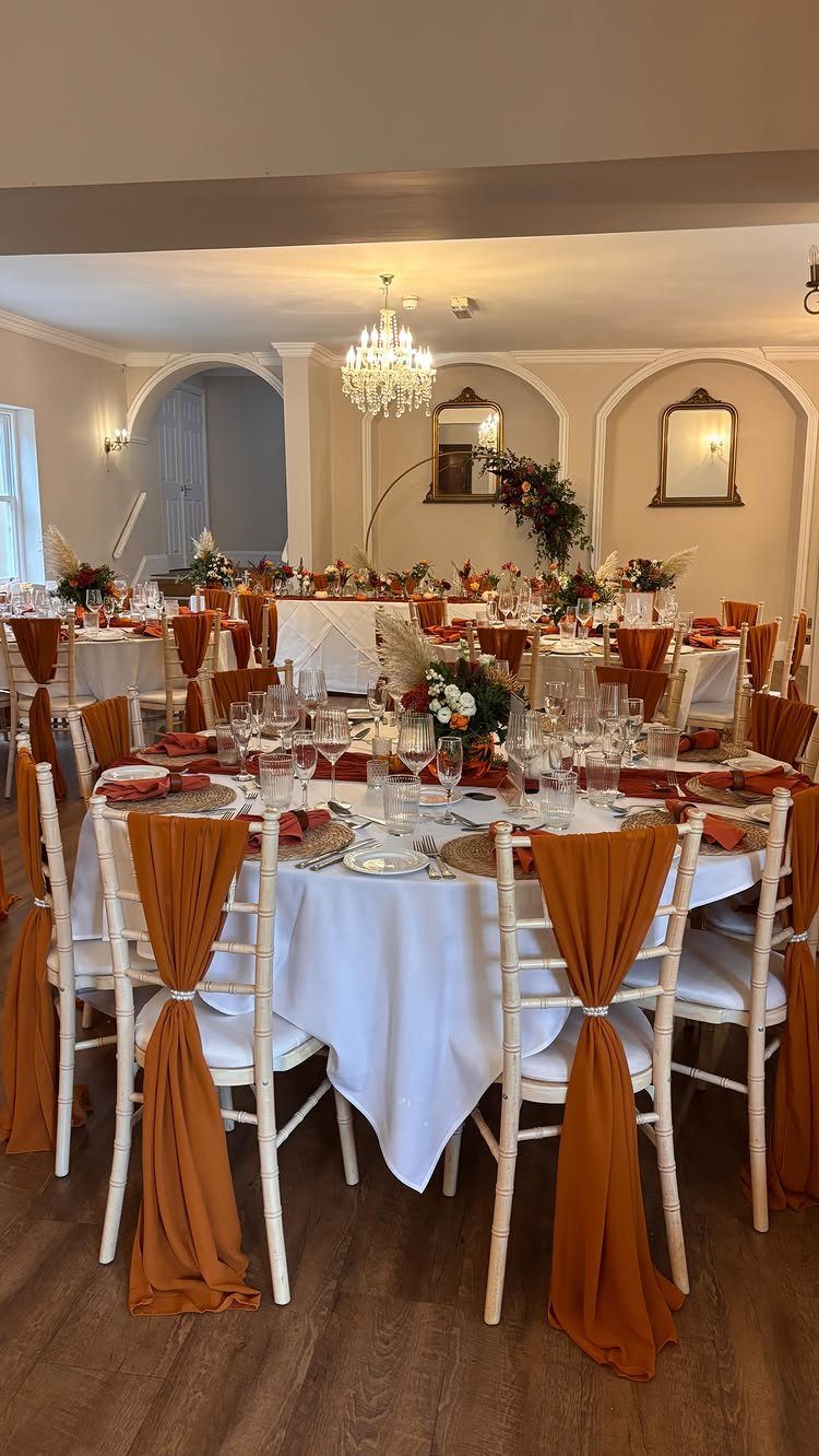
Burnt orange works best as an accent against a neutral base, and white linens give it exactly that. Napkins and chair sashes carry the color without swallowing the room, so the fall tone reads as deliberate rather than loud.
I’d keep the tablecloths white and let the orange live in the small, replaceable pieces. Sashes and napkins are also the cheapest places to commit to a bold shade, which matters when the budget is tight.
2. Navy
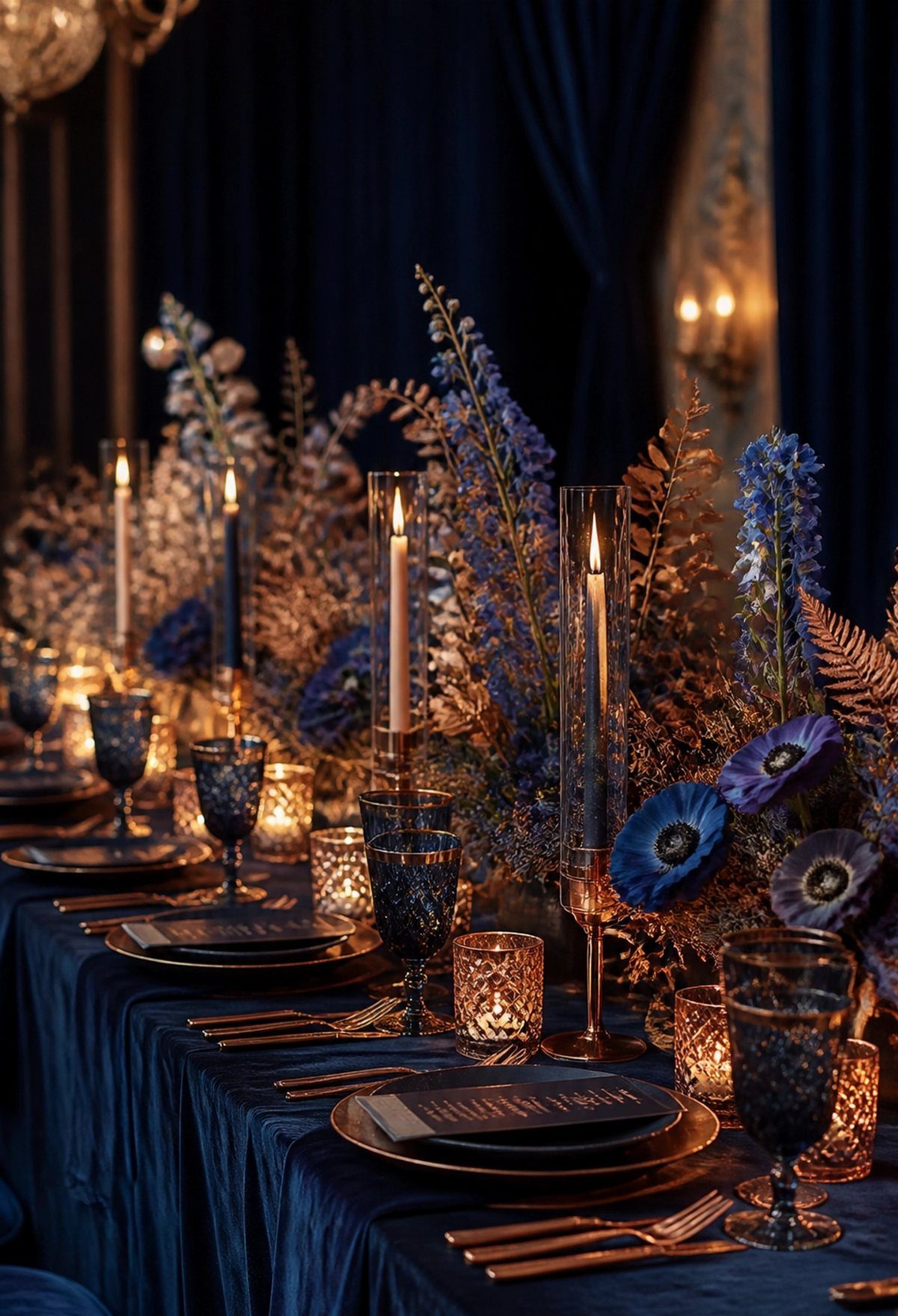
A deep navy table can look formal and warm at the same time, especially once candlelight hits it. Pairing a navy cloth and navy glassware with gold cutlery is the combination I’d choose for a fall wedding.
Blue flowers keep the palette tonal, while tall candles in glass holders add height and glow. Dark curtains behind the table deepen the mood further, though a lighter room would need more candles to get the same effect.
3. Vibgyor
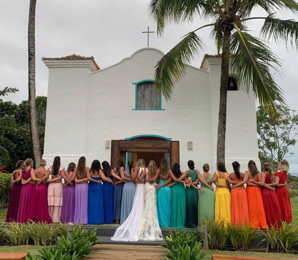
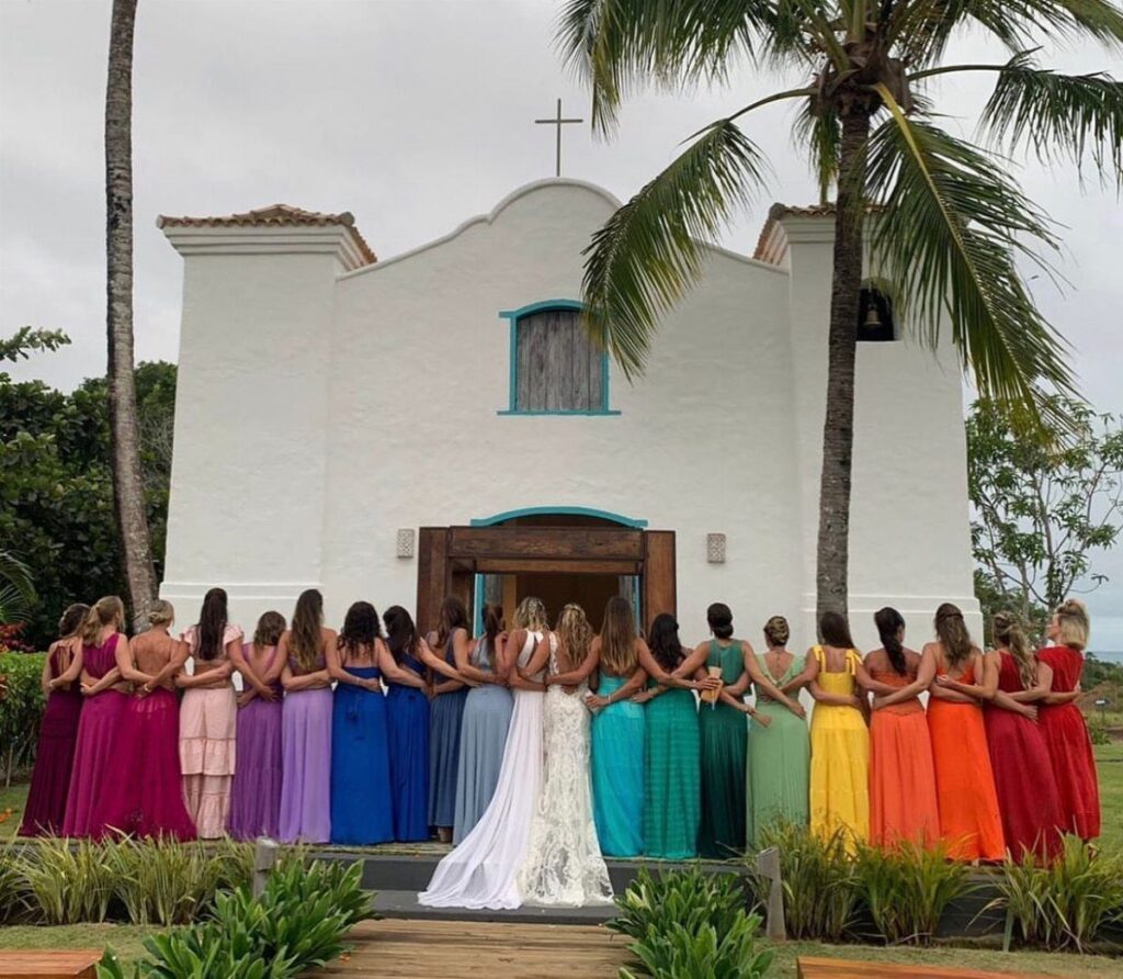
Rainbow dresses on the bridal party turn a palette into a statement, and a white church makes a clean backdrop for them.
To pull off a Vibgyor palette, give each bridesmaid one color of the spectrum (violet, indigo, blue, green, yellow, orange, red) and keep the bride in white so the rainbow has something to anchor against.
Assign colors early, since a full lineup needs one person per shade. Keep the bride’s look plain so the group reads as celebration instead of competition.
4. Black and Silver
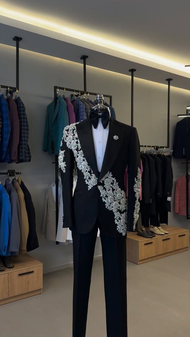
Silver embroidery on a black tuxedo gives a groom the formality of classic black with a bit of surprise in the detail. Floral stitching in particular softens the severity of the suit.
Before buying, ask to see the embroidery in person, because silver thread can look very different under store lights than under daylight or reception lighting. Try it with a plain black bow tie and keep everything else simple.
5. Natural Colors with Earth Brown
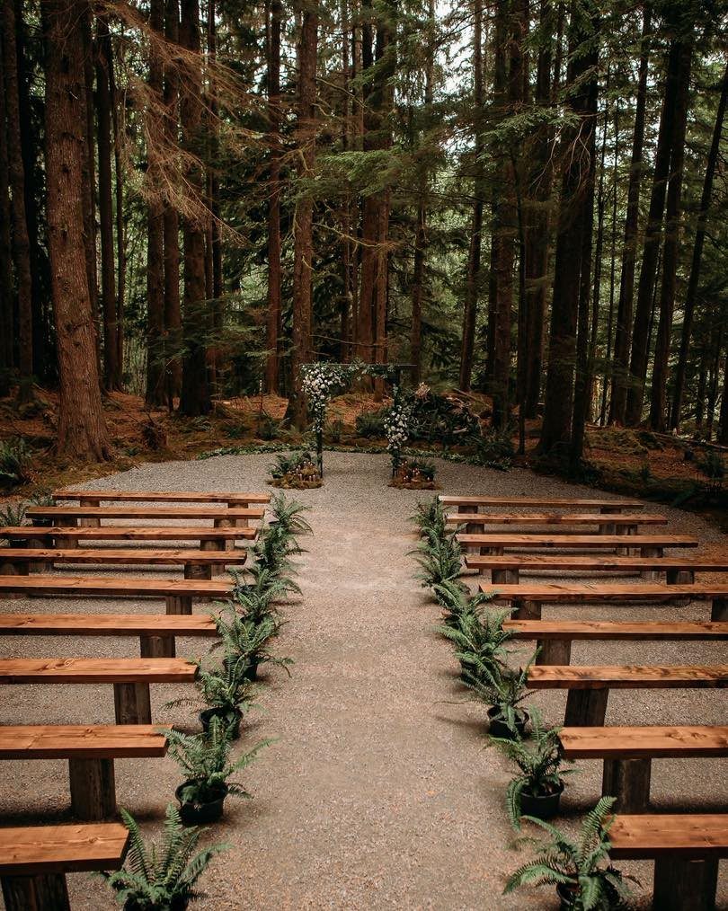
Earth brown and forest green need almost no styling in a wooded setting. Wooden benches, a floral arch and potted ferns along a gravel aisle let the surroundings supply the palette, which keeps decor spending low.
For summer, I’d add cream or soft white blooms to the arch so the browns don’t feel heavy. This is a quiet scheme, so texture does the work that bright color would elsewhere.
6. Pink and Green Table Setting
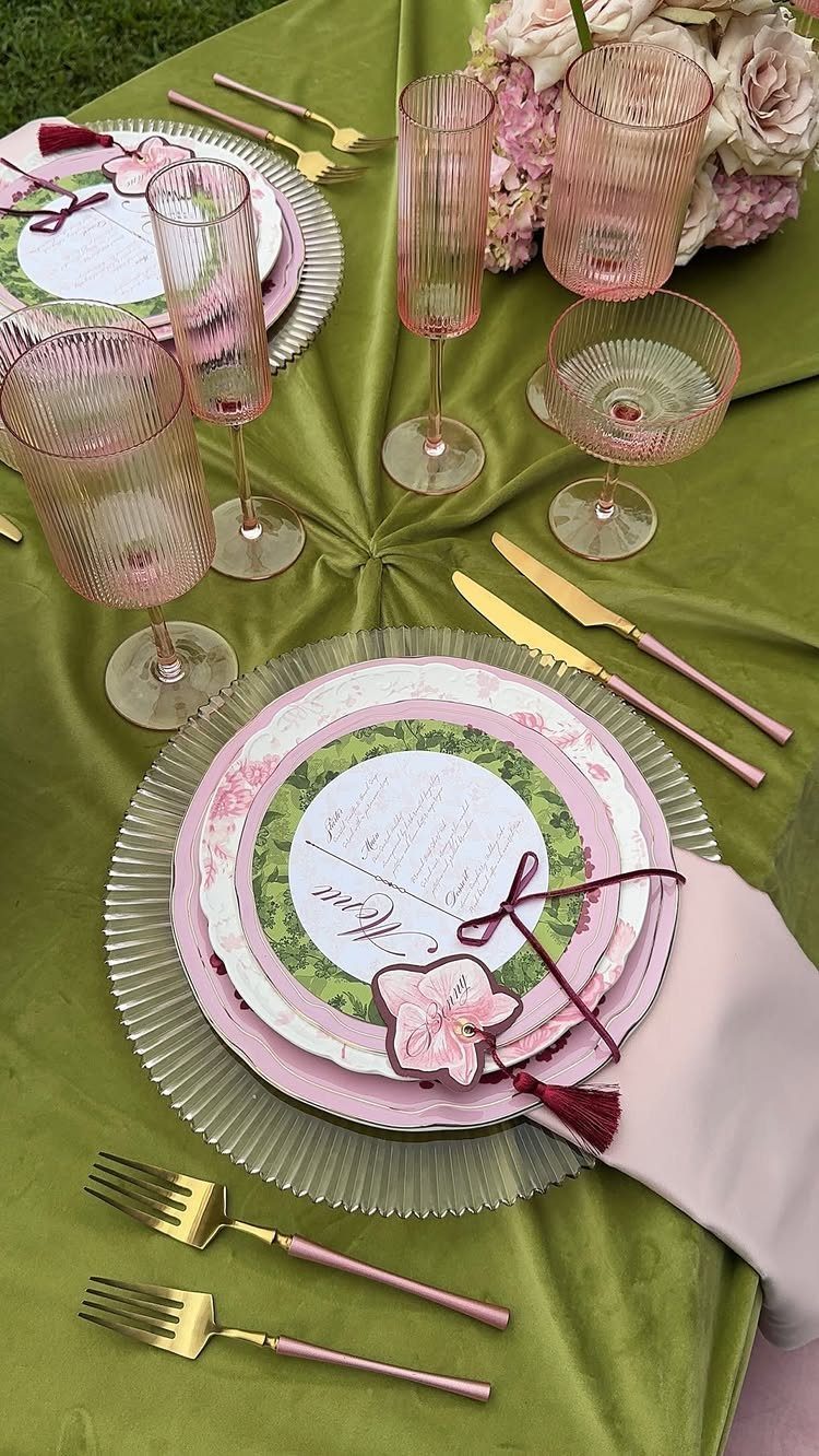
Pink glassware on a green velvet cloth is a bolder pairing than most couples try, and gold cutlery ties the two together. Velvet gives the green depth, so the pink reads as a jewel tone rather than a pastel.
A menu card on each plate is a small, cheap place to repeat the pink. I’d keep florals in the same 2 colors and let the gold stay on the flatware alone.
7. Dusty Blue and Gold Heels
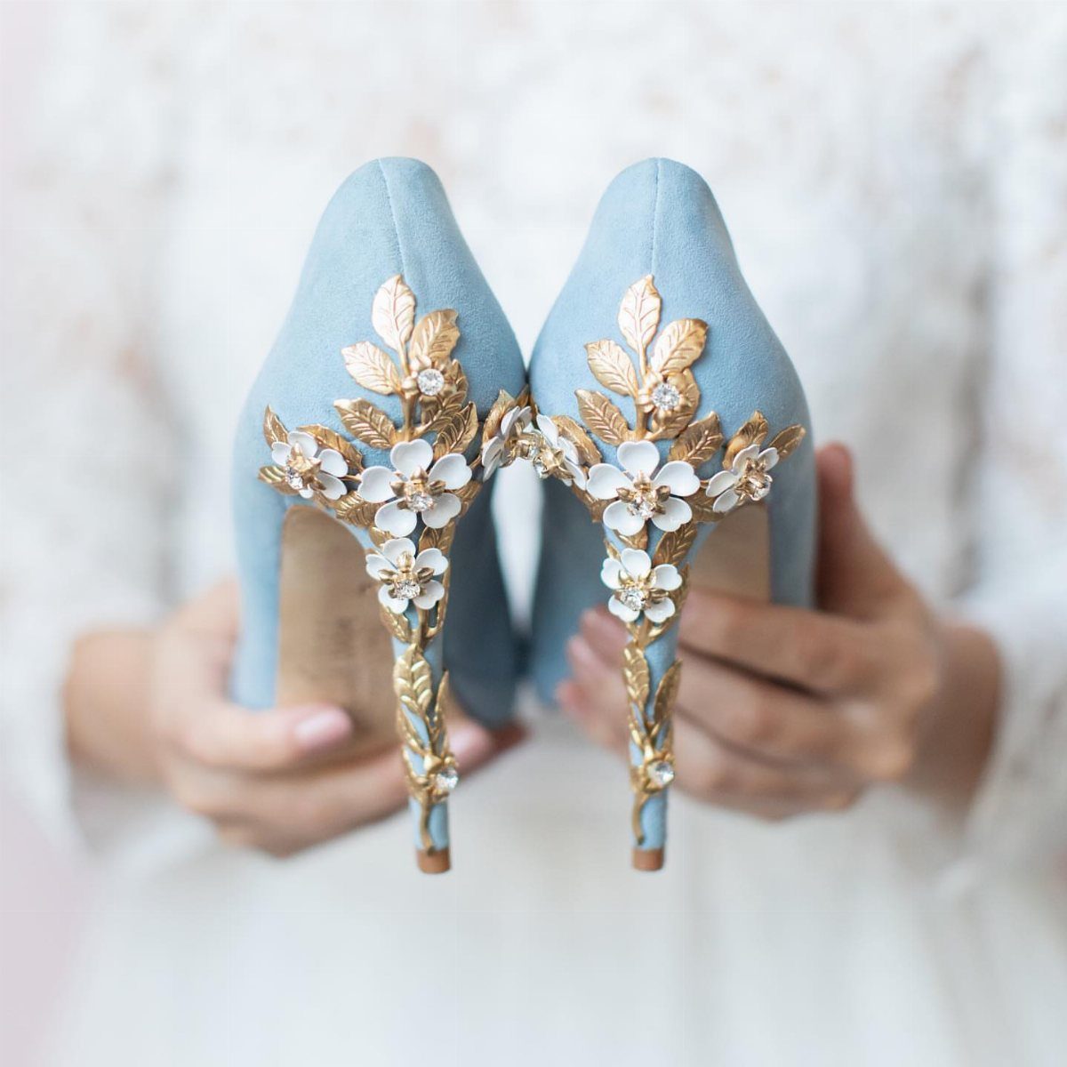
Shoes are the smallest place to commit to a color, and dusty blue heels with gold floral and leaf detail work as a "something blue" that doesn’t announce itself.
Against a white lace dress, the gold keeps the blue from looking flat.
I’d treat them as the one blue piece on the bride and skip matching jewelry in gold, so the embellishment stays the detail people notice up close. Bridesmaids in dusty blue would tie the look together.
8. Black and Deep Red Decor
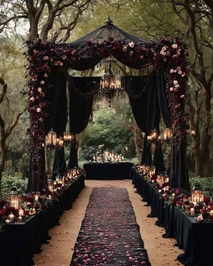
Black drapery behind a ceremony altar sets a mood that white and blush can’t, and deep red flowers give it warmth so it doesn’t feel like a funeral. A wooded setting helps, since the trees soften all that black.
Keep the reds in one family, burgundy through deep red, and add lanterns or candles for glow. Dark palettes soak up light, so I’d plan on more of it than you think you need.
9. Black and White Palette
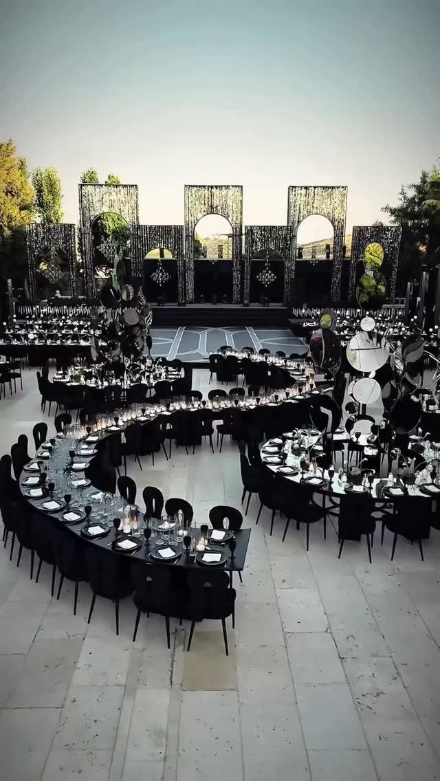
Curved black tables and black chairs on a white floor give a reception a graphic, gallery-like look with very little extra decor. The geometry does the work, so a few arches and some flowers are enough.
Black and white is the strictest palette you can pick, and it rewards restraint. I’d pick one element to be the statement, here the arches, and keep tableware plain.
Choosing Seasonal Colors
Season should set the starting point for a palette, but literal choices tend to backfire. Colors that sit too squarely on the season, such as orange and rust at every fall wedding, can make the day feel generic.
Trendy palettes carry a second risk. A shade that is everywhere when you book may look dated by the time you marry, so I’d pick colors you will still like when you flip through the photos long after the wedding.
For summer, go cheerful and bright instead of defaulting to the same safe, muted scheme. Summer light handles saturated color well, so you can be bolder than the season usually gets credit for.
Mixing Traditional and Modern Elements
A classic color can feel fresh when the details around it are modern.
Boho is a good example: earthy tones, flowing fabrics and rustic decor still form the base, but sleek furniture, geometric patterns and metallic accents now sit alongside them.
That mix keeps the mood relaxed without looking careless. I’d choose one or two modern elements and let the traditional palette carry the rest, since stacking too many contrasts makes a room feel undecided.
Handmade pieces keep the look personal. Handmade pieces, like a macrame backdrop you knot yourself or centerpieces you assemble, usually run cheaper than custom decor, and they add a bit of warmth next to the sleeker modern details.
Personalizing Your Wedding Theme
Your color scheme ties the whole day together, from invitations to guest dress code to the cake. Settle it early, because every later purchase gets easier once the palette is fixed.
To make it yours, start from a theme that means something to the two of you, whether that is a Parisian feel or something royal. Then pull colors from it instead of choosing colors first.
Personal sources work well too: places you have traveled, hobbies you share, or a favorite color. I’d pick one of those as the anchor and keep everything else supporting it, so the meaning stays easy to read.
Frequently Asked Questions
What colors are frowned upon at weddings?
Some cultures consider all black or all white inappropriate for guests or wedding decor, so check the customs of your families before committing.
Black can work well when it’s balanced: deep red flowers, lanterns and candles keep a black backdrop from feeling somber.
Deep colors like navy, black and oxblood drink in the glow of a room, so I’d budget for extra candles and string lights beyond what the floor plan seems to call for.
What are some quirky and unusual wedding themes?
Celestial, eco-friendly and bohemian chic themes are gaining popularity.
To keep a boho wedding from feeling dated, I’d hold onto the earthy palette, loose fabrics and rustic pieces, then mix in a sleek lounge sofa, a geometric print or a few brass accents.
Themes with personal meaning, like a Parisian or royal feel, also work well because you can pull the colors straight from them.