Ideas here run from a single gold tie on the groom to an outdoor tablescape full of blush blooms and gold candelabras, so how much gold you add depends mostly on your guest list and your venue.
1. Outdoor Tablescape
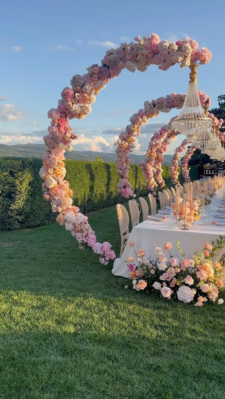
A long table under a gold chandelier and pink floral arches gives a lawn a dining room’s formality without walls.
White linens keep the pink and gold looking clean against green hedges, so I’d let the arches and chandelier carry the color and leave the cloth plain.
Hanging fixtures and florals need real anchoring outdoors, so ask your venue what the structures can support before you order anything.
2. Gold Ties
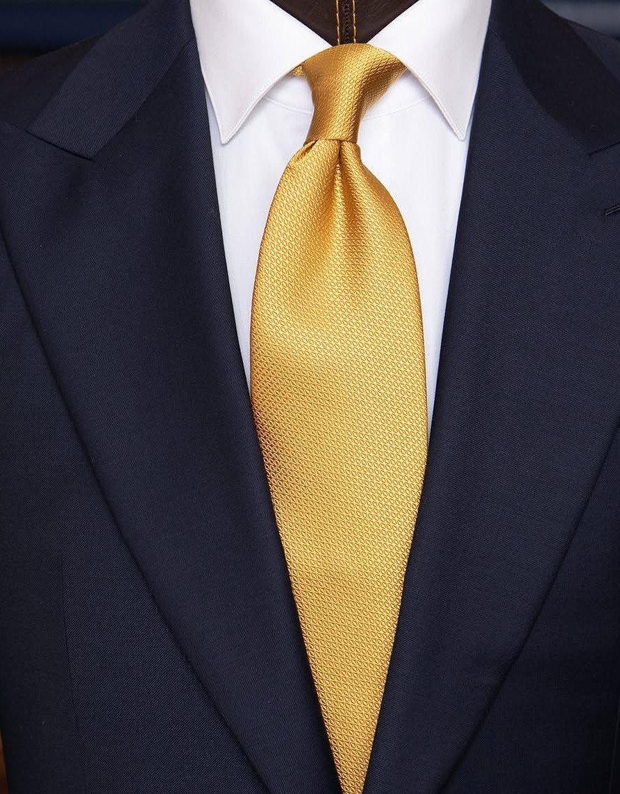
Navy and white make a quiet base, and a textured gold silk tie turns into the one bright note on the groom. A textured weave catches light better than flat satin, which matters in photos.
I’d put the groomsmen in the same navy suits and white shirts, then give only the groom the gold tie. Ties are cheap enough to match to your decor in person before the wedding.
3. Blush Blooms
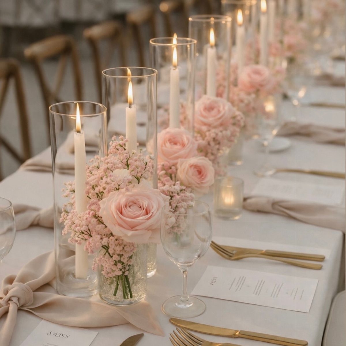
Soft pink roses with baby’s breath keep a table romantic without looking heavy. Against a white cloth and beige runners, blush reads as warm instead of sugary.
Low arrangements work best with candles in glass cylinders, because guests can still see each other across the table.
Gold flatware already supplies the metallic note, so the flowers can stay soft blush without any gilded accents. For a tight budget, I’d spend on the roses and let the baby’s breath fill the gaps.
4. Gold Candelabras
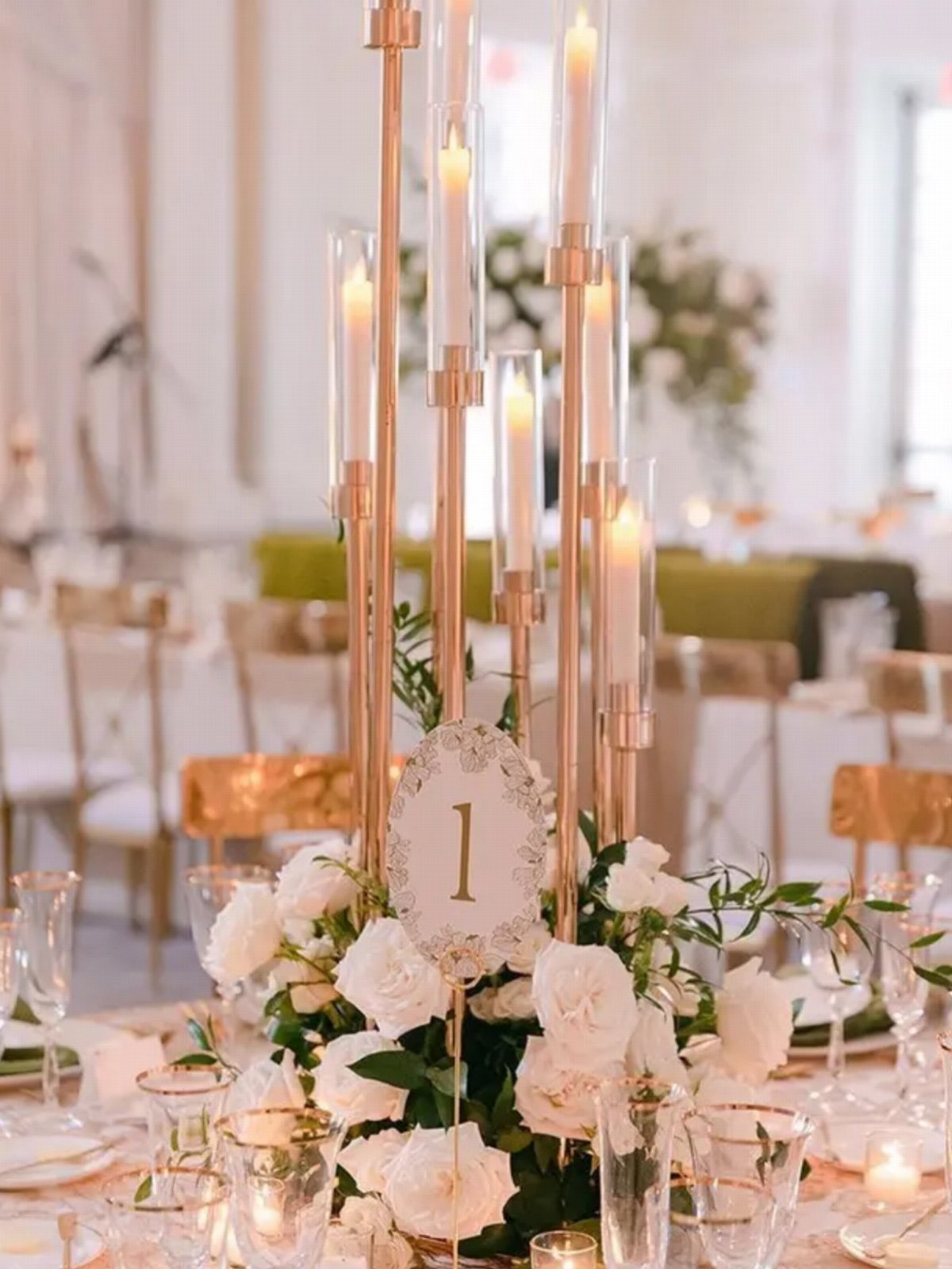
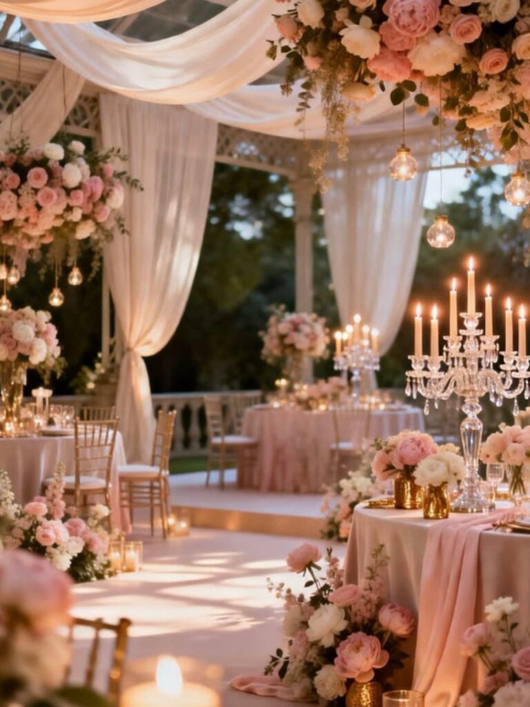
Few pieces say formal like a gold candelabra, and white candles with white roses keep it from feeling fussy. Gold chairs in an indoor space repeat the metal, so the table needs nothing else shiny.
Because the candelabra is already gold, I’d keep the flowers white or pale blush and let the metal supply the glow. Set a table number beside it where guests can spot it from a distance.
5. Blush Pink Bridesmaid Dresses
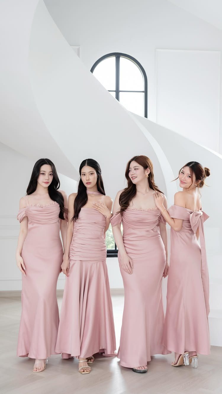
Blush satin in floor-length cuts looks polished, and the mix of styles in this group is the smart part. Letting each bridesmaid choose her own neckline in the same shade means everyone feels comfortable and the group still looks unified.
Order from one color family and check swatches together in daylight, since blush can swing peach or gray under different bulbs. Gold jewelry ties the look back to your palette.
6. Blush Pink Invitations with Gold Calligraphy
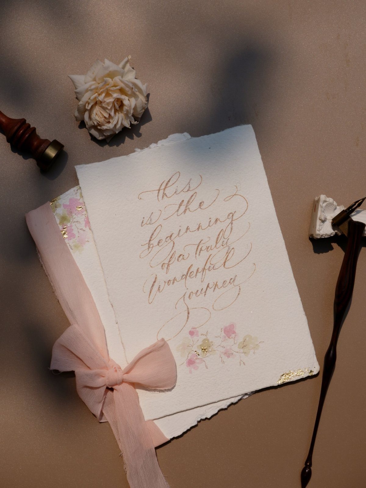
Gold calligraphy on white deckle-edged paper, tied with a blush ribbon, makes the invitation feel handwritten before anyone reads a word. The ribbon adds the pink without printing it, which keeps the card itself simple.
Hand lettering costs more than printing, so many couples reserve it for the main card, or for envelopes alone. Order a sample first, because gold ink can look very different on screen than on paper.
7. Napkins Folded Into Giant Bows
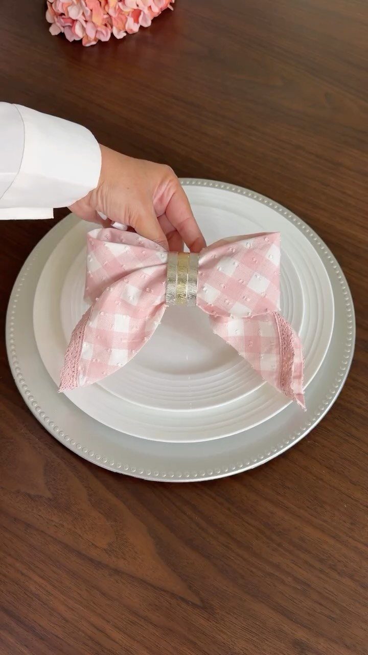
A checkered napkin tied into an oversized bow gives a plain white plate a place card’s worth of charm, and the pink check with a gold ring keeps both colors in play without any extra decor.
Because the napkin does the decorating, the plate can stay simple.
Cloth napkins hold a bow shape better than paper, and a ring at the center keeps the knot from loosening.
Fold one test napkin before you commit, since a bow that looks right on one plate needs to repeat across every seat.
I’d pick a pattern like this over solid pink, because the check hides small creases.
Choosing the Right Venue
Start with the walls. Ivory or cream rooms give pink and gold a quiet backdrop, while a venue with strongly colored walls, carpet, or wood paneling will compete with both shades.
Pink and gold look best against some architecture: think ballroom moldings, a historic hall with carved details, or a garden estate with stone terraces.
If you’re touring, ask to see the room at the hour your reception will actually happen, since gold looks warmer in evening light than at noon.
For fabric, drape the space in blush and gold only if the room is plain. An already ornate room needs less from you, which can lower your decor spend.
Symbolism of Colors
Blush pink carries a soft, romantic feeling, and gold brings in a touch of polish and luxury.
That pairing gives you a way to decide what stays and what goes: if an item doesn’t feel soft or warm, it probably doesn’t belong.
Gold works best beside soft pinks, though it can also sit well with a brighter hot pink if you want more energy.
Spend gold where light hits it: gilded rims on china and glassware, or shimmering linens with gold accents.
A little gold on desserts also adds sparkle without extra decor, and paper goods like place cards and table numbers can carry gold lettering.
Gold is another color that is frequently used as an accent, as incorporating it into décor adds a regal, refined element to the day. When you pair pink and gold together, however, the end result is absolutely beautiful.
Wedding Theme Versatility
This palette scales in both directions. A small guest list can lean on a few strong pieces, such as gold-rimmed plates and blush florals, while a grand celebration can add fabric draping, candlelight, and ornate architecture.
Pick the scale first, then the color amounts. Smaller weddings can use gold as a light accent and keep pink dominant; larger rooms can handle more metal without feeling crowded.
Since blush already shows up in linens, florals, and bridesmaid dresses at so many weddings, your version will stand out through the gold and how you place it.
Frequently Asked Questions
Do pink and gold go together?
Yes, and soft blush pink with gold is the pairing I trust most. Gold adds polish and a warm glow while blush keeps the room romantic, so neither feels heavy.
Gold earns its place on surfaces that catch candlelight, so I’d spend it on charger rims, flatware, and candle holders rather than spreading it across every surface.
What does pink mean in weddings?
Pink stands for love, tenderness, and romance. Blush, which is also called dusty or pale pink, reads soft and warm.
Bridesmaid dresses, bouquets, and small decor touches all carry it well, and I use one filter on each pick: anything that reads as cold or sharp next to the blush tones can stay off the list.
What colors go well with gold for a wedding?
Blush pink, white, and cream are the best partners for gold.
White linens and cream or ivory walls give the metal a quiet backdrop, while blush adds softness. Navy also works as a base if you want a more tailored look, with one gold accent like a textured silk tie.